Hi guys, how are you?’ we think you all are good. So now we learn and create Circular Countdown Timer with the help of Circular Countdown Timer package. but first, we understand what is a countdown timer package and why we use it.
A circular countdown timer package in Flutter is a pre-built component or library that provides functionality for displaying and managing countdown timers in a circular format. It is typically used in Flutter applications to create visually appealing and interactive timers, such as countdowns for events, quizzes, games, or any other time-based activities.
To create a circular countdown timer in Flutter, you can make use of the ‘circular_countdown_timer 0.2.3 ‘ package. This package provides a customizable circular progress indicator that can be used to display a countdown timer. Here’s how you can use it to create a circular countdown timer in Flutter
Step 1: Add the package dependency
Open your project’s ‘pubspec.yaml’ file and add the following dependency:
dependencies:
  circular_countdown_timer: ^0.2.3
Save the file and run flutter pub get to fetch the package.
Step 2: Implement the Circular Countdown Timer
In your Flutter code, import the required package:
import 'package:flutter/material.dart';
import 'package:circular_countdown_timer/circular_countdown_timer.dart';
Then, create a stateful widget to hold the countdown timer:
import 'package:flutter/material.dart';
import 'package:circular_countdown_timer/circular_countdown_timer.dart';

void main() => runApp(const MyApp());

class MyApp extends StatelessWidget {
  const MyApp({Key? key}) : super(key: key);

  @override
  Widget build(BuildContext context) {
    return MaterialApp(
      debugShowCheckedModeBanner: false,
      title: 'Circular Countdown Timer Demo',

      theme: ThemeData(
        primarySwatch: Colors.green,
      ),
      home: const MyHomePage(title: 'Circular Countdown Timer',),
    );
  }
}

class MyHomePage extends StatefulWidget {
  const MyHomePage({Key? key, this.title}) : super(key: key);

  final String? title;

  @override
  State<MyHomePage> createState() => _MyHomePageState();
}

class _MyHomePageState extends State<MyHomePage> {
  final int _duration = 10;
  final CountDownController _controller = CountDownController();

  @override
  Widget build(BuildContext context) {
    return Scaffold(
      appBar: AppBar(
        title: Text(widget.title!,style: TextStyle(fontSize: 20),),
        centerTitle: true,
      ),
      body: Center(
        child: CircularCountDownTimer(
          // Countdown duration in Seconds.
          duration: _duration,

          // Countdown initial elapsed Duration in Seconds.
          initialDuration: 0,

          // Controls (i.e Start, Pause, Resume, Restart) the Countdown Timer.
          controller: _controller,

          // Width of the Countdown Widget.
          width: MediaQuery.of(context).size.width / 2,

          // Height of the Countdown Widget.
          height: MediaQuery.of(context).size.height / 2,

          // Ring Color for Countdown Widget.
          ringColor: Colors.grey[300]!,

          // Ring Gradient for Countdown Widget.
          ringGradient: null,

          // Filling Color for Countdown Widget.
          fillColor: Colors.green[600]!,

          // Filling Gradient for Countdown Widget.
          fillGradient: null,

          // Background Color for Countdown Widget.
          backgroundColor: Colors.green[500],

          // Background Gradient for Countdown Widget.
          backgroundGradient: null,

          // Border Thickness of the Countdown Ring.
          strokeWidth: 20.0,

          // Begin and end contours with a flat edge and no extension.
          strokeCap: StrokeCap.round,

          // Text Style for Countdown Text.
          textStyle: const TextStyle(
            fontSize: 33.0,
            color: Colors.white,
            fontWeight: FontWeight.bold,
          ),

          // Format for the Countdown Text.
          textFormat: CountdownTextFormat.S,

          // Handles Countdown Timer (true for Reverse Countdown (max to 0), false for Forward Countdown (0 to max)).
          isReverse: false,

          // Handles Animation Direction (true for Reverse Animation, false for Forward Animation).
          isReverseAnimation: false,

          // Handles visibility of the Countdown Text.
          isTimerTextShown: true,

          // Handles the timer start.
          autoStart: false,

          // This Callback will execute when the Countdown Starts.
          onStart: () {
            // Here, do whatever you want
            debugPrint('Countdown Started');
          },

          // This Callback will execute when the Countdown Ends.
          onComplete: () {
            // Here, do whatever you want
            debugPrint('Countdown Ended');
          },

          // This Callback will execute when the Countdown Changes.
          onChange: (String timeStamp) {
            // Here, do whatever you want
            debugPrint('Countdown Changed $timeStamp');
          },

          /*
            * Function to format the text.
            * Allows you to format the current duration to any String.
            * It also provides the default function in case you want to format specific moments
              as in reverse when reaching '0' show 'GO', and for the rest of the instances follow
              the default behavior.
          */
          timeFormatterFunction: (defaultFormatterFunction, duration) {
            if (duration.inSeconds == 0) {
              // only format for '0'
              return "Start";
            } else {
              // other durations by it's default format
              return Function.apply(defaultFormatterFunction, [duration]);
            }
          },
        ),
      ),
      floatingActionButton: Row(
        mainAxisAlignment: MainAxisAlignment.center,
        children: [
          const SizedBox(
            width: 30,
          ),
          _button(
            title: "Start",
            onPressed: () => _controller.start(),
          ),
          const SizedBox(
            width: 10,
          ),
          _button(
            title: "Pause",
            onPressed: () => _controller.pause(),
          ),
          const SizedBox(
            width: 10,
          ),
          _button(
            title: "Resume",
            onPressed: () => _controller.resume(),
          ),
          const SizedBox(
            width: 10,
          ),
          _button(
            title: "Restart",
            onPressed: () => _controller.restart(duration: _duration),
          ),
        ],
      ),
    );
  }

  Widget _button({required String title, VoidCallback? onPressed}) {
    return Expanded(
      child: ElevatedButton(
        style: ButtonStyle(
          backgroundColor: MaterialStateProperty.all(Colors.orangeAccent),
        ),
        onPressed: onPressed,
        child: Text(
          title,
          style: const TextStyle(color: Colors.white),
        ),
      ),
    );
  }
}
Output
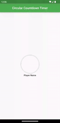
For a new & Attractive Circular Countdown Timer
If you want a New and attractive Circular Countdown Timer as you saw in the top gif then you add these codes in your main.dart file. in my code I am using a gradient borders package and Google Font package for looking attractive and cool if you want then you add this package to your project.
import 'package:flutter/material.dart';
import 'package:circular_countdown_timer/circular_countdown_timer.dart';
import 'package:google_fonts/google_fonts.dart';
import 'package:gradient_borders/gradient_borders.dart';

void main() => runApp(const MyApp());

class MyApp extends StatelessWidget {
  const MyApp({Key? key}) : super(key: key);

  @override
  Widget build(BuildContext context) {
    return MaterialApp(
      debugShowCheckedModeBanner: false,
      title: 'Circular Countdown Timer Demo',

      theme: ThemeData(
        primarySwatch: Colors.green,
      ),
      home: const MyHomePage(title: 'Circular Countdown Timer',),
    );
  }
}

class MyHomePage extends StatefulWidget {
  const MyHomePage({Key? key, this.title}) : super(key: key);

  final String? title;

  @override
  State<MyHomePage> createState() => _MyHomePageState();
}

class _MyHomePageState extends State<MyHomePage> {
  final int _duration = 10;
  final CountDownController _controller = CountDownController();

  //For player turn Timer Color/Font size..
  Color btnbackgroundColor = Colors.green;

  String image = "https://img.freepik.com/free-photo/young-beautiful-woman-pink-warm-sweater-natural-look-smiling-portrait-isolated-long-hair_285396-896.jpg";
  String Name = "Player Name";

  @override
  Widget build(BuildContext context) {
    return Scaffold(
      appBar: AppBar(
        title: Text(widget.title!,style: TextStyle(fontSize: 20),),
        centerTitle: true,
      ),
      body: Center(
        child:  Column(
              mainAxisAlignment: MainAxisAlignment.center,
              children: [
                Container(
                  width: 150,
                  height: 120,
                  decoration: BoxDecoration(
                    shape: BoxShape.circle,
                    image: DecorationImage(
                      image: NetworkImage(
                        image,
                      ),
                      fit: BoxFit.cover,
                    ),
                  ),
                  child: _circleTimerAuto(),
                ),
                SizedBox(height: 5,),
                Text(
                  Name,
                  style: GoogleFonts.roboto(
                    fontSize: 14,
                    color: Colors.black,
                    fontWeight: FontWeight.bold,
                    decoration: TextDecoration.none,
                  ),
                ),
              ],
            ),

      ),

    );
  }

  Widget _circleTimerAuto() {
    return CircularCountDownTimer(
      // Countdown duration in Seconds.
      duration: _duration,
      initialDuration: 0,
      controller: _controller,
      width: MediaQuery.of(context).size.width / 2,
      height: MediaQuery.of(context).size.height / 2,
      ringColor: Colors.grey[300]!,
      ringGradient: null,
      fillColor: btnbackgroundColor,
      fillGradient: null,
      backgroundGradient: null,
      strokeWidth: 4.0,
      strokeCap: StrokeCap.round,
      textStyle: GoogleFonts.poppins(
        fontSize: 00.0,
        color: Colors.transparent,
        fontWeight: FontWeight.bold,
      ),
      textFormat: CountdownTextFormat.S,
      isReverse: false,
      isReverseAnimation: false,
      // Handles visibility of the Countdown Text.
      isTimerTextShown: true,
      // Handles the timer start.
      autoStart: true,
      onComplete: () {
        setState(() {
          //OPEN widget..
          FinalResultDialog(context,image,Name);
        });
      },
      timeFormatterFunction: (defaultFormatterFunction, duration) {
        if (duration.inSeconds == 0) {
          return "Start";
        } else if (duration.inSeconds > 6) {
          Future.delayed(Duration.zero, () async {
            setState(() {
              btnbackgroundColor = Colors.red;
            });
          });
        }

      },
    );
  }


  //Final result dialog...
  void FinalResultDialog(BuildContext context, String Pimage, String WinnerplayerName,) {
    showGeneralDialog(
      context: context,
      barrierLabel: "Result",
      barrierDismissible: true,
      barrierColor: Colors.black.withOpacity(0.5),
      transitionDuration: Duration(milliseconds: 700),
      pageBuilder: (BuildContext buildContext, Animation animation,
          Animation secondaryAnimation) {
        return Center(
          child: Container(
             height: MediaQuery.of(context).size.height/2,
             width: MediaQuery.of(context).size.width/1.2,
            decoration: BoxDecoration(
              borderRadius: BorderRadius.all(Radius.circular(20)),
              border: const GradientBoxBorder(
                gradient: LinearGradient(colors: [
                  Color(0xFFf5c642),
                  Color(0xFFf5c543),
                  Color(0xFFe3ac20),
                  Color(0xFFcc7d23)
                ]),
                width: 4,
              ),
              image: DecorationImage(
                  image: NetworkImage(
                      "https://png.pngtree.com/thumb_back/fh260/background/20220523/pngtree-stage-podium-with-rays-of-spotlights-for-award-ceremony-winner-with-image_1400291.jpg"),
                  fit: BoxFit.cover),
              color: Colors.white,
            ),
            child: SizedBox.expand(
              child: Column(
                 mainAxisAlignment: MainAxisAlignment.center,
                children: <Widget>[
                  Container(
                    margin: EdgeInsets.only(bottom: 60,left: 10),
                    decoration: BoxDecoration(
                      borderRadius: BorderRadius.only(
                        bottomLeft: Radius.circular(20.0),
                        bottomRight: Radius.circular(20.0),
                      ),
                    ),
                    child: CircleAvatar(
                      radius: 80,
                      backgroundImage: NetworkImage(
                        Pimage,
                      ),
                    ),
                  )
                ],
              ),
            ),
          ),
        );
      },
      transitionBuilder: (_, anim, __, child) {
        Tween<Offset> tween;
        if (anim.status == AnimationStatus.forward) {
          tween = Tween(begin: Offset(0, 0), end: Offset.zero);
        } else {
          tween = Tween(begin: Offset(0, 1), end: Offset.zero);
        }
        return SlideTransition(
          position: tween.animate(anim),
          child: FadeTransition(
            opacity: anim,
            child: child,
          ),
        );
      },
    );
  }

}
Output
Conclusion
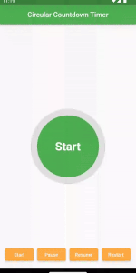
That’s it! You have created a basic circular countdown timer and advanced widget in Flutter. The timer starts at 0 and progresses towards the maximum duration, which is 10 seconds in this example. Once the duration is reached, the timer stops and opens the new Widget which shows some information you add as your requirements.
You can customize the appearance of the circular countdown timer by modifying the CircularProgressIndicator widget’s properties in the build method of _CircularCountdownTimerState.
Remember to add any necessary modifications and enhancements to the widget based on your specific requirements.
❤️❤️ Thanks for reading this article ❤️❤️
If I got something wrong? Let me know in the comments. I would love to improve 🥰🥰🥰.
Clap 👏👏👏 If this article helps you.
if you like our work so please follow us on this Dosomthings
Our New and Attractive articles: