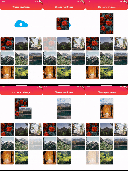
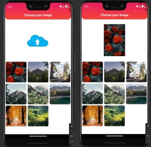
In today’s Flutter development guide, we’re diving into an exciting feature: Drag and Drop in Flutter. Drag-and-drop interfaces are interactive and engaging, giving users control over arranging items as they like. In this tutorial, you’ll learn to create a drag-and-drop experience for images using Flutter. By the end, you’ll have a beautifully designed app where users can drag images from a grid and drop them into a designated area.

Why Use Drag and Drop in Flutter?
Drag-and-drop functionality can greatly improve UX, especially for visual-oriented apps. Whether you’re building an app for organizing photos, interactive games, or even lists, drag-and-drop adds a dynamic element. Plus, Flutter makes implementing Drag and Drop in Flutter surprisingly easy with widgets like Draggable and DragTarget.
Getting Started with Drag and Drop in Flutter
Let’s jump into the Flutter drag and drop implementation! Below, you’ll find the complete code for creating a drag-and-drop image picker in Flutter. We’ll explain each part in detail to ensure you can customize it for your own use cases.
Full Code Example
Here’s the main code. This example sets up a screen where users can drag images from a grid and drop them into a display area. Copy and paste this code into your Flutter project to get started.
import 'package:flutter/material.dart';

class DragDrop extends StatefulWidget {
  const DragDrop({super.key});

  @override
  State<DragDrop> createState() => _DragDropState();
}

class _DragDropState extends State<DragDrop> {

  List<String> images = [
    'assets/images/dd1.jpg',
    'assets/images/dd2.jpg',
    'assets/images/dd3.jpg',
    'assets/images/dd4.jpg',
    'assets/images/dd5.jpg',
    'assets/images/dd6.jpg',
    'assets/images/dd9.jpg',
    'assets/images/dd10.jpg',
  ];

  String chosenImage = "assets/images/dd_drop.jpg";

  @override
  Widget build(BuildContext context) {

    return Scaffold(
      backgroundColor: Colors.white,
      appBar: AppBar(
        backgroundColor: Colors.transparent,
        elevation: 0,
        title: Text('Choose your Image',
          style: TextStyle(
            fontWeight: FontWeight.bold,
            color: Colors.white,
            fontSize: 20
          ),
        ),
        flexibleSpace: Container(
          decoration: BoxDecoration(
            borderRadius: BorderRadius.only(
                bottomLeft: Radius.circular(20),
                bottomRight: Radius.circular(20),
            ),
            gradient: LinearGradient(
              colors: [
                Colors.red,
                Colors.pink,
              ],
              begin: Alignment.bottomCenter,
              end: Alignment.topCenter,
            )
          ),
        ),
        centerTitle: true,
      ),
      body: ListView(
        shrinkWrap: true,
        children: [
          SizedBox(height: 30,),
          Center(
            child: SizedBox(
              height: 200,
              width: 200,
              child: DragTarget<String>(
                  builder: (context, v1, v2) {
                    return ClipRRect(
                      borderRadius: BorderRadius.circular(20),
                      child: Image.asset(chosenImage, fit: BoxFit.contain),
                    );
                  },
                  onAccept: (value) {
                    setState(() {
                      chosenImage = value;
                    });
                  },
              ),
            ),
          ),
          SizedBox(height: 30,),
          GridView.builder(
            gridDelegate: SliverGridDelegateWithFixedCrossAxisCount(crossAxisCount: 3),
            itemCount: images.length,
            shrinkWrap: true,
            itemBuilder: (context, index) {
              return Draggable(
                data: images[index],
                child: imageCard(index, 1),
                feedback: imageCard(index, 1),
                childWhenDragging: imageCard(index, 0.3),
              );
            },
          )
        ],
      ),
    );
  }

  Widget imageCard(int index, double opacity) {
    return Opacity(
      opacity: opacity,
      child: Container(
        width: 120,
        height: 120,
        margin: EdgeInsets.all(4),
        child: ClipRRect(
          borderRadius: BorderRadius.circular(8),
          child: Image.asset(images[index], fit: BoxFit.cover),
        ),
      ),
    );
  }
}
Breaking Down the Code
Setting Up the Image Data
In the images list, we define the paths to all our draggable images. You can replace these with any image paths you want. The chosenImage variable represents the image currently displayed in the drop area, and it updates every time an image is dropped onto the target.
The DragTarget Widget
The DragTarget widget serves as the drop zone. It detects when an item is dropped and triggers an onAccept callback, allowing us to update the displayed image with the dropped image. It also offers other callbacks, such as onWillAccept, for more control.
The Draggable Widget
Each image in the grid is wrapped in a Draggable widget. The data property is used to pass the image path to the DragTarget. The feedback property lets us show a “floating” version of the image while it’s being dragged. The childWhenDragging controls the appearance of the image in its original position during the drag.
Customizing Your Drag and Drop UI in Flutter
- Changing Layouts: Modify
SliverGridDelegateWithFixedCrossAxisCountto control the grid structure. For example, usecrossAxisCount: 2for a two-column layout. - Adding Animations: Use Flutter animations, such as
ScaleTransitionorSlideTransition, for smoother interactions. - Responsive Design: Add conditions to adjust the layout for different screen sizes.
Benefits of Drag and Drop in Flutter
Drag and drop in Flutter provides a natural, intuitive experience for users. This approach can:
- Enhance Interactivity: Engage users with intuitive item management.
- Boost Retention: Users are more likely to interact with content they can personalize.
- Streamline Workflows: Ideal for apps that involve organization or categorization.
Conclusion
This drag-and-drop tutorial in Flutter demonstrates just how easy it is to integrate this functionality. You can use this as a foundation to build even more complex interactions, such as dragging list items, creating sortable lists, or even making interactive games with drag mechanics.
Flutter’s powerful and flexible design allows for a seamless drag-and-drop experience that can boost engagement in your app. If you’re looking for more Flutter development tips or want to learn how to build interactive widgets, follow us for more tutorials.
Output

❤️❤️ Thanks for reading this article ❤️❤️
If I got something wrong? Let me know in the comments. I would love to improve 🥰🥰🥰.
Clap 👏👏👏 If this article helps you,
if you like our work, please follow us on this Dosomthings
Our more attractive articles:
Refresh in Flutter: How to implement Pull to Refresh in Flutter?
Date & Time in Flutter: How to Format Date and Time in Flutter
Hero Widget: How to Use the Hero Widget in Flutter: A Complete Guide


