Hi, guys In the last article we learn how to create a simple flutter progress bar but in this article, we have to learn how to make an animated progress bar with simple steps. You will find tons of widgets to beautify your user interface in Flutter. In this example, we have used one of the packages that help in creating an animated liquid wave progress indicator very easily with little code. You can create both circular and linear progress indicators for your app. See the example below, and read the explanation in the code.
Step1: First you need to implement liquid_progress_indicator dependency into your pupspec.yaml file.
dependencies:
liquid_progress_indicator: ^0.4.0
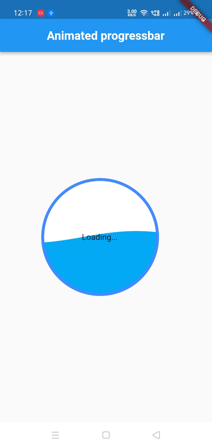
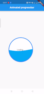
Step 2: Use this widget to make a circular liquid progress indicator:
LiquidCircularProgressIndicator(
  value: 0.25, // Defaults to 0.5.
  valueColor: AlwaysStoppedAnimation(Colors.pink), // Defaults to the current Theme's accentColor.
  backgroundColor: Colors.white, // Defaults to the current Theme's backgroundColor.
  borderColor: Colors.red,
  borderWidth: 5.0,
  direction: Axis.horizontal,
  // The direction the liquid moves (Axis.vertical = bottom to top, Axis.horizontal = left to right). Defaults to Axis.vertical.
  center: Text("Loading..."),
)
Output
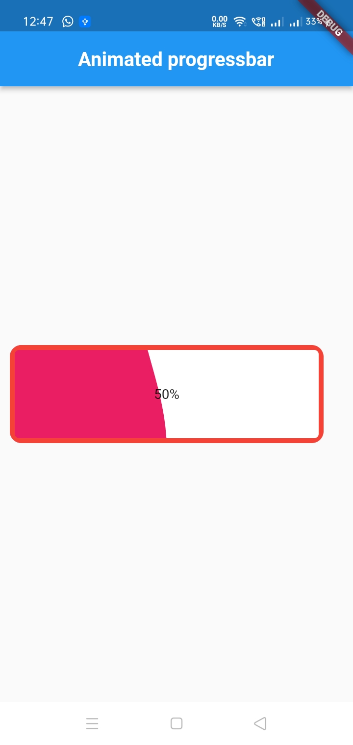
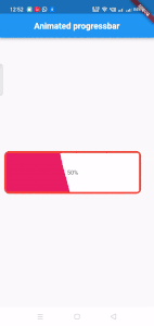
Step 3: Use this widget to make a circular linear progress indicator:
Padding(
    padding: EdgeInsets.all(10.0),
    child: Center(
      child: Container(
        margin: EdgeInsets.only(right:20),
        child: SizedBox(
          width: MediaQuery.of(context).size.width,
          height: 50,
          child: LiquidLinearProgressIndicator(
            value: 0.45, // Defaults to 0.5.
            valueColor: AlwaysStoppedAnimation(Colors.pink), // Defaults to the current Theme's accentColor.
            backgroundColor: Colors.white, // Defaults to the current Theme's backgroundColor.
            borderColor: Colors.red, //border color of the bar
            borderWidth: 5.0, //border width of the bar
            borderRadius: 12.0,//border radius
            direction: Axis.horizontal,
            // The direction the liquid moves (Axis.vertical = bottom to top, Axis.horizontal = left to right). Defaults to Axis.horizontal.
            center: Text("50%"), //text inside bar
          )
        ),
      ),
    ),
  ),
Output
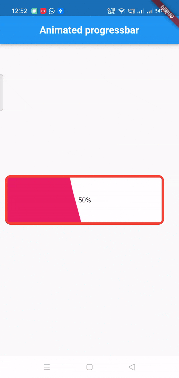
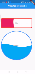
Step 4: See the full example below, and read the explanation comments in the codes.
import 'package:flutter/material.dart';
import 'package:liquid_progress_indicator/liquid_progress_indicator.dart';

class LiquidProgress extends StatefulWidget {
  @override
  _CircularProgressIndicatorClassState createState() => _CircularProgressIndicatorClassState();
}

class _CircularProgressIndicatorClassState extends State<LiquidProgress> {
  bool loading = false;

  @override
  Widget build(BuildContext context) {
    return Scaffold(
      appBar: AppBar(
        centerTitle: true,
        title: Text('Animated progressbar',style: TextStyle(fontSize: 20,fontWeight: FontWeight.bold),),
      ),
      body: Padding(
          padding: EdgeInsets.all(10.0),
          child: Center(
            child: Column(
              mainAxisAlignment: MainAxisAlignment.center,
              children: <Widget>[
                Container(
                    margin: EdgeInsets.only(right:20),
                    child: SizedBox(
                      height: 100,
                      child: LiquidLinearProgressIndicator(
                        value: 0.45, // Defaults to 0.5.
                        valueColor: AlwaysStoppedAnimation(Colors.pink), // Defaults to the current Theme's accentColor.
                        backgroundColor: Colors.white, // Defaults to the current Theme's backgroundColor.
                        borderColor: Colors.red, //border color of the bar
                        borderWidth: 5.0, //border width of the bar
                        borderRadius: 12.0,//border radius
                        direction: Axis.horizontal,
                        // The direction the liquid moves (Axis.vertical = bottom to top, Axis.horizontal = left to right). Defaults to Axis.horizontal.
                        center: Text("50%"), //text inside bar
                      ),
                    )
                ),
                SizedBox(height: 30,),
                Container(
                    margin: EdgeInsets.only(right:20),
                    child: SizedBox(
                      height: 300,
                      child:  LiquidCircularProgressIndicator(
                          value: 0.5, // Defaults to 0.5.
                          valueColor: AlwaysStoppedAnimation(Colors.lightBlue), // Defaults to the current Theme's accentColor.
                          backgroundColor: Colors.white, // Defaults to the current Theme's backgroundColor.
                          borderColor: Colors.blueAccent,
                          borderWidth: 5.0,
                          direction: Axis.vertical,
                          // The direction the liquid moves (Axis.vertical = bottom to top, Axis.horizontal = left to right). Defaults to Axis.vertical.
                          center: Text("Loading..."), //text inside it
                      )
                    )
                ),
              ],
            )
    )
    )
    );
  }
}